In the last article, I discussed the great use of new software to build interactive dashboards to show the most important indicators in a company while retaining interactivity. But, beyond the dashboards, you would want to know that how to write a data analysis report like a pro.
Why? Because there are times when you don’t want only to show information to your audience – you want to make a point.
Probably it’s because you found something while investigating those huge datasets that really caught you off guard, and you want everyone to know about it.
Perhaps you found a faulty process and you want to analyse many courses of corrective action.
Or you may want to implement new ideas to improve sales.
In these cases when your analysis leads to a story that you can tell your audience to make them arrive at the same conclusions you made, reports come in. That’s why it really important for you to know how to write a data analysis report like a pro so that you can make a rock-solid impact!
I’ve worked in many companies where dashboards weren’t implemented and the main way to communicate indicators to the executive with periodical measurements of certain indicators was to mail them a report.
Sometimes these reports included some analysts’ explanation of the changes of the numbers from point A to B in time, but, mostly, these reports were some static version of a dashboard. With technology nowadays on our side, this isn’t the idea of reports that I’m trying to tell you about.
So, what is a report?
A report tells your audience a story and backs it up with indicators and stats. However, they aren’t scientific papers.
While reports can include methodologies, be rigorous and have a thread like paper. Most of the times your readers won’t care about how you conducted your investigation while replicating your findings, not even to assess whether your methods are correct. This is your job and probably your boss’.
What they want to hear is a compelling story. They are waiting to be convinced of your conclusions.
Great, where do I get started?
Here I answer and suggest some of the most crucial things to suggest how to write a data analysis report.
First of all, whatever your report is about, you start with a problem or a question you want to solve. You’ll write about this in your introduction, where you’ll also write, albeit briefly, about the tools and methods you used for the data analysis.
Most of the times you can omit these things and leave your problem statement only, so as not to lose your reader’s attention from the very beginning, especially when reports go to high executives.
Once the problem is introduced, you’ll have a body where you further describe and analyse the problem with the available data. Here you’ll measure and plot all the necessary indicators to support the conclusions you’ll make at the end of the report.
In this point, I suppose you’ve arrived to correct conclusions and that you’ve tested them in order to gather evidence of the correctness of them. Testing them could be done by either using statistical tests or by searching for hard evidence against your hypothesis.
If you do not find conclusive and strong proofs against your hypothesis, it stays. If you do find then go back and do the work again, please do not lie to yourself and your bosses.
The report tries to make a point arriving at a certain conclusion, therefore, gather all the evidence in the body of the report. Isolate the most convincing arguments and, if possible, show opposing views that can’t be supported with the available data. This kind of intellectual honesty will gather strong support for the opposing view and add more credibility to the conclusions
You can also have a descriptive report, where you want to find why certain indicators changed the way they did. Or you would also want to know whether this is positive or negative and if there are any correlations among variables that affect these indicators.
You should avoid making a conclusion in a descriptive report. Sometimes, executives want to be the ones making conclusions or suggestions from the report and want to have an accurate description of the changes in indicators and highlight the most important ones with the biggest changes.
This is in contrast with dashboards, where they are left to figure it out for themselves.
Warning! When graphs become your enemy
I’ve talked lots about reports being stories, but they’re kind of boring stories. Or, in fact, they’re like trying to explain the story to someone who hasn’t heard of it and does not have much time to listen to you anyway.
So, with this in mind, your main goal is coming as clear as it’s possible to what you’re trying to convey with the minimal amount of wording possible. And seriously, that’s the best advice for how to write a data analysis report like a pro.
Anything else it’s just a distraction. This is especially true for plotting data sets in your reports.
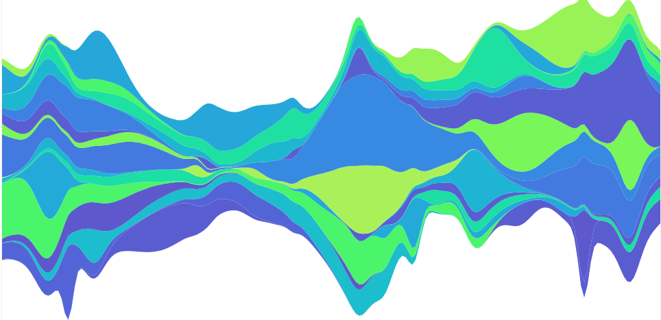
Many like including lots of plots in their reports. This can lead to cluttering the reader’s vision and diverting his attention to unimportant things.
Avoid it at all costs.
Memorize this for your entire career: any graph that doesn’t back any of your points and that you don’t refer to in the main body of your argumentation, it’s best to eliminate it.
When you’re talking to someone and this person strays from the thing they’re trying to tell you and you’re becoming increasingly upset by this, you say: ‘Okay, but, go to the point!’. Keep this attitude with your reports. If possible, get someone else to do proofreading for you – only then you can receive criticism from someone who can abstract from the problem you’ve faced and for which you’re writing your report.
Choosing the right graphs
Even if many graphs are backing the main point, you should consider whether your arguments are evident in this visualizations. If not, better try to aggregate your data or change the visualization completely.
There are many considerations that can be had with graphs. There are entire courses and lots of scientific research that’s done on the topic of visualization of information.
You should be faithful to these points when graphing:
- Be minimalist: don’t make things more complex than they need to be, they obscure the intent of the graph.
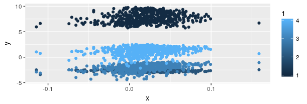
- Beware of distortions in the visualization with respect to the data being mapped to a visualization. Many graphs vary more than one visual element for each variation on a single variable in data (see the graph below). Never EVER do something like that. This is plain lying, do not compromise your credibility by designing something of this sort.
- Give context to the data. Don’t distort your conclusions by avoiding comparisons of the same indicator at different points in time, for example. Give spatial and temporal context for the reader to compare.
- Avoid cluttering a charts area with many things happening at once in your graph. Keep it as simple as you can while the data can still be understandable.
Just look at this graph, for example.
This is an abomination from the same depths Cthulhu came.
It’s beyond repair. It’s better to not plot anything than plotting something so misleading.
You can also calculate a “lie factor” by calculating the ratio of variation in data with the variation of the visual metaphor, in this case, the coin. In this example, it goes through the roof. Any number apart from approximately 1 is heavily distorting the data, giving the reader the impression of a variation in data that doesn’t exist.
For those of you who want to delve deeper into this fascinating world, check the following books:
- “Readings in Information Visualization. Using Vision to Think.” Card, S., Mackinlay, J., and Shneiderman, B. Morgan Kaufmann Pub., 1999.
- “Beautiful Evidence”, Edward R. Tufte, Graphics Press, 2006
Tools you can use
Basic tools
In this case, there aren’t many specific tools for reporting. You can use any standard text processor like LibreOffice, Abiword, Google Docs, MS Word, etc. for standard writing. Then you can include plots coming from other tools, like those we’ve seen for dashboards, and also spreadsheet software like LibreOffice, Google Sheets and MS Excel.
More advanced tools
For those of yearning for something deeper, there are tools that help integrating code for data analysis, graphing and text for reports, compiling later to reports in various formats, like Rmarkdown (R code) and Jupyter Notebooks. There’s also LaTeX, which is a way of formatting documents with code, it’s outcome looks super professional and it’s a standard in scientific publishing.
I’ll add two great open source code libraries for those who want to draw with them. You’ll find lots of templates of graphs and give you more freedom to do complex, innovative visualizations.
- D3.js (JavaScript)
- Processing (Java, JavaScript)

Whew! Lots of info for you to go through. We’ve explored lots of things about how to write a data analysis report like a pro in this article! I’ve illustrated some key points for you to consider for your reports and for you to explore for yourself from now on. Look at other reports made in your sector and that other person made to learn both from the good and the bad. Read and write reports with a critic mind. Get started right now!
See you in the next article!
[grwebform url=”https://app.getresponse.com/view_webform_v2.js?u=hDnOf&webforms_id=20436505″ css=”on” center=”off” center_margin=”200″/]