You’ve heard about and learnt lots of Analytics and Data Science but do not know any programming language. This is putting you in a spot – how to do data analysis for your company during your internships or in projects using all the data that’s available to you?
One of the crucial keys to derive good insights and make a great impact is a BI dashboard. This article will guide you with what BI is and will give you a feeler of how to do data analysis when you don’t know much of programming.
Also Read: Learn R for Market Research and Analytics
In this article, I will give you some tips and tools that can help you in making a great impact by creating a BI dashboard really fast.
Entering into the Business Intelligence realm
Business Intelligence can be defined as gathered information being shown in the form of graphs, dashboards, reports, etc., that show the current state of certain indicators, metrics in order to make certain aspects of the business relevant.
These metrics include the company’s KPIs (Key Performance Indicators). This information is then actionable, that is, the company can then take action so as to make improvements in its business.
So, where to start? What should you focus on? How to do data analysis?
Any sector of a company has KPIs which they consider relevant to their operations. Most of them are also related to the company’s goals. If there are no KPIs, you should suggest measuring this sector’s work, generating new KPIs!
Measuring and quantifying paves the road to actionable insights that your company can profit from.
If KPIs are already established, you can check how are they communicated to the executives. Some choose regular reports, which are a way in which managers get some insights from analysts.
But some of these reports are compiled in such a way that they do not tell a story or generate a profound insight. This is where a BI dashboard becomes a good replacement for such reports to create a quick impact of business intelligence.
Why is BI dashboard important?
While I harp on the benefits of dashboards, you must know that there are lots of companies that do not make use of BI dashboards!
This is where you come in.
BI Dashboards show KPIs displayed as charts, graphs, tables and numbers on a single screen.
Each part of the dashboard is one of many aspects of a single problem being observed, so they are related. These relations in data are the basis of the interactivity in dashboards: they allow filtering, grouping or highlighting the data displayed by clicking on different parts of the graphs.
The condensation of information on a single screen about a single problem with the added interactivity is the main advantage of using dashboards to control KPIs and explore the data relevant to a single problem.
How would you build these dashboards?
So while you still might be thinking about how to do data analysis, you would be wondering how would you build these dashboards. There are many tools available you can use for building BI dashboards. You should assess which tools are currently being used in your company.
If it is a spreadsheet program, you should know the pros and cons of such software for dashboard building. In a nutshell, they allow a good level of granularity for manipulating the data but make dashboards hard to build, including the interactivity, and even harder to maintain and deploy for the whole company at large.
There are lots of new software that make this task very easy and maintainable. Leverage this knowledge in your favour!
I’ll show you some of the tools that are among the most found in companies. Though it isn’t meant to be exhaustive, it serves as an idea of the software you can find in the market.
Licensed tools for creating a BI dashboard
-
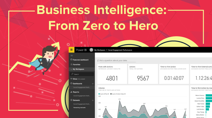
- PowerBI (free desktop version as of nowadays, 29-April-2018)
2. Tableau
3. Microstrategy
4. QlikView
5. SAS
Open source tools (can imply some knowledge of coding)
– R
– Python
Which data should be chosen for graphing?
If there are no or little indicators in the sector you are in, your main goal is finding them first.
Though every company’s main goal is profit, each sector has sub-goals aligned with this main purpose, so the best indicators are those which are correlated with these goals, either positively or negatively.
Correlation can be shown either plotting the main goal measure against other variables and looking for a relationship between these other variables and the main target variables.
Evolution over time of the target variable is also an indicator of how things are going, especially when following indicators’ performance over time.
Both the company and competitors take actions when in open competition. Individuals preferences changes, new policies by different governments tilt income distribution to favour some sectors, new technologies emerge… all of these affect your indicators through time, increasing or decreasing profit.
When you find a correlation, you’ve found gold! That can be an actionable variable that can be included in the dashboard because it has an impact on profitability.
A word of warning!
Everything can be measured but keep it simple: while dashboards offer the equivalent of a sandbox where users can “play” clicking everywhere, the dashboard as a whole has a context, and users should not be able to escape it, so as not to lose perspective on what is being communicated.
This should be validated by the users of the dashboard. There must be a clear goal for the dashboard use, and you should strive to keep aligned with it.
Which tools should I use?
For quick results, I suggest going with point-and-click, drag-and-drop software like the licensed ones above. Some of them give a free desktop edition for personal use which you can use to fiddle around while you learn and to use at work whenever possible.
This type of software is very easy to learn, has most of the things you might want to do solved and have great communities of fellow users in forums to which you turn for help. Paid licenses also offer support.
Start using these tools for a quick impact of business intelligence – some quick wins. Don’t become too stressed in trying to do complicated things with software: it’s a means to an end, gaining new insights and monitoring performance.
Dashboards are tools you can offer to your company during your internship or work experience, it’s value added right away by leveraging your recently acquired knowledge and the most advanced tools available nowadays.
They offer a very direct way to interact with a dataset not only by just looking at a data table, but also being instantly aware of some relationships that arise from different variables.
Also Read: Learn R for Market Research and Analytics
Okay, I’ve set up a BI dashboard for the company and they loved it! What do I do now?
My first thought: try to make it as automatic as possible.
If the IT department or someone with a direct connection to databases can help you to deploy this new dashboard so that it can connect to the latest data so that the dashboard can refresh automatically and can be consumed directly by its users, you’ll be in the best of the worlds possible.
As a maxim: don’t turn yourself into a dashboard-maintainer: you are a data analyst, keep the never-ending search for patterns in any data as your primary quest!
Along with that keep on implementing your findings, models, etc. so that it can become an asset to your company, but do not become consumed by this task: there are much more difficult areas of data science that are waiting for you!
Conclusion
In this article, I discussed how to do data analysis for someone without any programming experience. I talked about how creating these easy to make business intelligence dashboard could make a lot of difference in how you analyze and interpret data. This would have definitely answered a part of the question you came here with ‘how to do data analysis?’.
In the next articles, I will talk about reports: a way to communicate important findings similar to storytelling. I will also look at some basic statistics you can use and some great books in Statistics that can help you achieve rapid wins while understanding what you’re doing.