As an aspiring data scientist data is got to be your best friend. There are all kinds of data that you will encounter and probably already do encounter in your life. So how do you begin with such overwhelming data? This article on Basic Statistics for Data Science lets you of all the most basic statistic knowledge that you need to know before you can do anything with your data.
In the last articles on How to do Data Analysis and How to write a Data Analysis Report like a pro, you saw some guidelines for making both dashboards and reports. Dashboards and reports are the simplest, quickest output you can make, though your mileage may vary. You can make things as complex as you want.
The main goal of this article is to go deeper into data analysis. Both reporting and dashboards are, most of the times, Exploratory Data Analysis, or Exploratory Data Analysis. That is, Exploratory Data Analysis is the first thing you do when given any new task: your first glance to data.
Also Read: Learn R for Market Research and Analytics
For you to be able to perform a thorough Exploratory Data Analysis, you need to make sure that you know the basic powers that statistics as a subject offers you.
So if you could be a freshman still going through a statistics course at college.
Or you could be a young professional in a business analyst position who is looking to quickly brush-up her statistics.
Here’s a quick-yet-detailed article on Basic Statistics for Data Science.
Why do Exploratory Data Analysis?
While some approaches don’t rely too much on doing Exploratory Data Analysis before getting into applying models, knowing what kind of dataset you have in front of you helps you to understand the outcome of models.,
Exploratory Data Analysis helps you exactly with that. It gives you the first impression about what your dataset is all about.
Not just that, exploratory data analysis may even help you in modifying the data to adapt to a certain characteristic of datasets that don’t fit with certain algorithms.
For example, some of these datasets have trouble with missing values, others have troubles with too many outliers [1], others need to be passed only numeric data matrices, and so forth.
You can also benefit by knowing about the distributions of variables, especially if you want to apply some algorithms or statistical techniques that require potent but require some assumptions about the distribution of the underlying data.
For example, many techniques require a normal distribution of data and few to no outliers in order to produce very good outputs. In controlled experiments with few data points approaches like this are often applied.
Some Basic Statistics for Data Science
For Exploratory Data Analysis and to formalize it a little bit we’re going to explore first the most basic metrics you can find in statistics: mean, median, mode, quantiles and standard deviations. These basic statistics for data science will help you become endowed with all the ammunition you require to know more about your dataset.
Arithmetic Mean
This is the most basic statistics for data science. The arithmetic mean or average of a variable is simply the sum of the values that compose a numeric variable divided by the total number of items in that variable.
With the median, they both represent a centrality measure: they both try to point at the middle of data. Sometimes this value, or nearby values, can be the most frequent values, though not necessarily so – you must check these assumptions.
What’s also important is that arithmetic mean has a big disadvantage: it can be heavily distorted by outliers.
Median
The median is the value in the middle of a sorted numeric variable.
That’s the value where, if we saw all numbers laid upon a continuous horizontal line, half of the observations lie to the left and the other half lie to the right.
Mode
This is simply the value that it’s observed the most. There can be one modal values: they are the most frequent data values.
Quantiles
We take the definition of the median and expand it a little further: whereas the median is the value that splits the data in half, the quantiles can split the data into a certain percentage.
For example, quintiles are those values that can split the data into five parts with an equal number of observations. Deciles are similar but they split the data into ten parts.
In general, the X%th percentile (note this new term) is the point where X% of the data is below that value and (1 – X)% of the data points are over that value.
Standard Deviations
Standard deviation is a measure of deviations of data around the mean. It’s calculated by taking the square root of the variance, which is the average of the squared difference of each data point with respect to the mean. For example, take a look at the following graph.
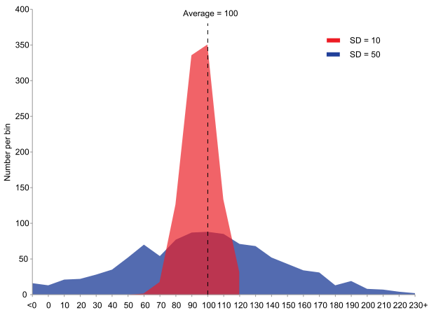
This graph is an example of the concepts of variance and standard deviations.
Both of these graphs show the frequency of observations of a certain phenomenon (“y” axis, “Number per bin”) and the bins (“x” axis).
Both variables have the same average value, 100. But you can see that the red graph has a higher frequency of values around bins close to the average, while the blue one is the inverse case.
Why is this of any importance?
If someone asked you to give a prediction of the value that you’ll expect this phenomenon to get, you’ll be more accurate to answer the mean if you have a distribution of values like in the red graph as opposed to the blue one, where you can be pretty inaccurate to answer the mean.
Thus, you can observe that the blue distribution has a higher standard deviation (SD in the chart) than the red one.
Given this definition, we can now start exploring the data.
Graphing
When exploring data, graphs are your allies. They can test some of the early hypothesis you have about your data and can help you make findings that you wouldn’t otherwise find by just looking at raw data.
Some of the most used graphs for data exploration are:
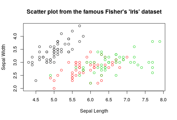
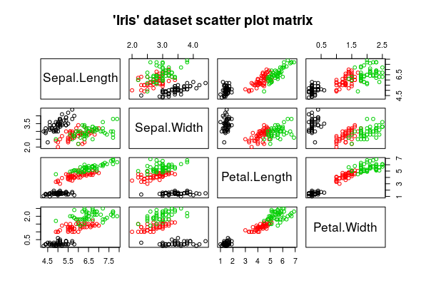
Scatter Plots
You plot a numeric variable against another one to see if they follow any pattern among themselves. This is one of the fastest ways to visualize a bivariate correlation (that is, a correlation of two variables).
You’ll make lots of scatter plots of many variables against other ones to see if there’s any relation between them
Boxplots
Great to see how the data is distributed (this is the frequency in which you observe the data in a certain range of the values of that variable ) and to detect univariate outliers.
Boxplots are great at this task, so it is often a quick, handy tool.
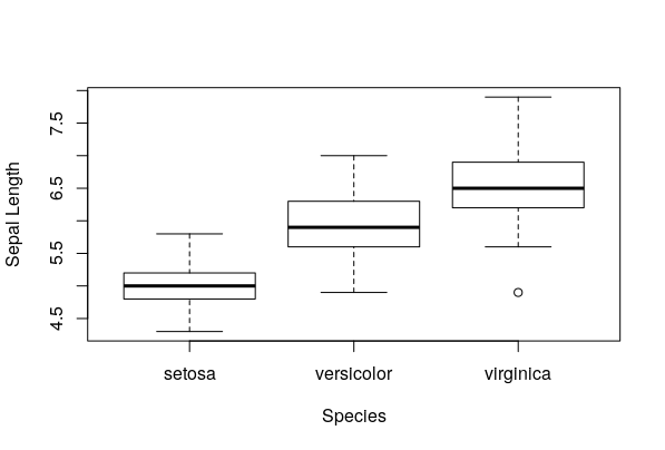
They are interpreted this way:
The box represents the middle range of data, from 25% percentile to 75% percentile. The strong black line in the middle represents the median.
The dashed lines represent the “whiskers” – these kinds of plots are also named “box and whiskers” plot. They are represented, conventionally, by multiplying 1.5 to the 75% percentile up and to the 25% percentile down.
Any observations that lie beyond the whiskers are represented with a dot – these are typical outliers.
Sometimes you can also find that different kind of outliers are distinguished with different variations, according to the distance to the median, to the box or to the whiskers, by classifying them in categories like “weak outliers” for those close to the whiskers and “severe outliers” for those really far from the whiskers and the rest of the plot.
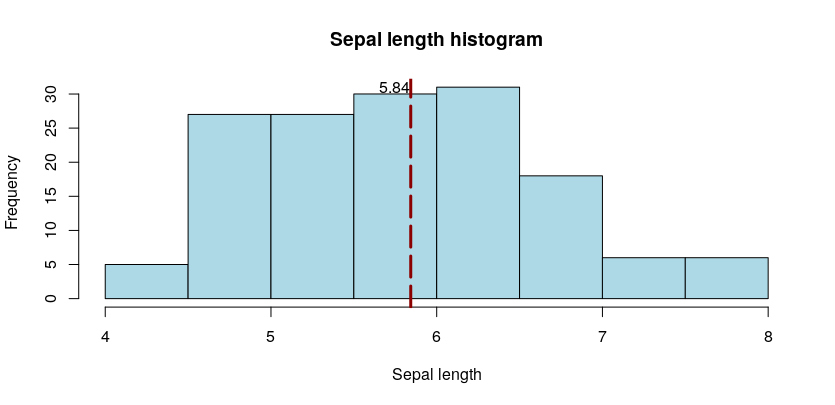
Histograms
They show the count (frequency) of observations that fall within a certain range of a continuous, numeric variable. It’s also used to view the empirical distribution of the data being plotted, and, in some cases, it can be useful to detect groups of outliers too.
These are the simplest tools you’ll use time and time again, the foundations of data exploration.
Also Read: Learn R for Market Research and Analytics
Conclusion
With these Basic Statistics for Data Science, you can then apply different data mining and statistical methods for further investigation and apply new tests to validate the new hypothesis that may develop during the exploratory phase. With these newly found tools, we’ll see in the next article an applied example of the use these tools can have using the R programming language and a real dataset.
Stay tuned for more data science and statistical analysis!
______________________________________________
[1] Outliers can be both nemesis or pure gold. As a general definition, outliers are values that are “really far” from the rest of the data. For example, suppose that you observe a variable that has values between 1 and 10, and then you see a 1,000,000. It’s super weird, depending on what that variable is that can be an error in the data or a possible and super interesting value