Sales Dashboards are a really crucial part of the sales and marketing process as these dashboards not only get you insights about the sales process but they also give a clear indication of how the marketing processes are working.
Now while I can go on and on telling you about what are sales dashboards and what are the most important metrics and KPIs that you must have on your sales dashboard, the point of writing this blog post is not that.
In this article, I will share with you how you as a marketing manager can represent your sales and marketing data in the form of super-interactive dashboards coded in R.
So be it a meeting that you're going to attend which requires you to crunch a lot of data, or a review where you need to share with your bosses a ton of data - a dashboard can be one easy way to navigate and share that data with anyone.
I begin by sharing you the story of why I had to create a basic Sales Dashboard for one of my reviews at my workplace. And then, I'll give you a step by step run through of how to build it for yourself.
Now most of you, managers and MBAs might not be able to understand most of the code that I share below. And my idea is not even to make you understand the coding part of it.
Far from it.
You can get a coder in your company or a freelancer to code out the dashboard for you.
The reason why I am writing this post is to give you an idea of how you as a manager or a consultant can change the way you express your data. Just the way I did.
So let me tell you why I went on to create a sales dashboard in R that looked like this:
Back Story
“You have a review with the CTO on the 12th. Be prepared”, my boss told me a week in advance back in July.
I had been deeply involved in the sales process of one of the new and most promising products that the CTO and his Data Science team had developed. I was the sales & marketing end of the product whereas the Data Science team, which reports directly to the CTO, was the product end of this product.
The sales had been doing well. I had started off in mid-June as a one man sales and marketing team for that product. When the momentum picked up, I got on-board a team of IIT and DTU alumni with me to sell it.
We were a makeshift sales team that was supposed to engage for about 2-3 weeks, sell as much of this technical product as we can beyond the target and then disengage, back to our usual work with our usual products.
This review on the 12th of July, was surely going to be hinged a lot on that new product and what has been my success and failure in it.
Now, my CTO swears by numbers, data and those two things presented well. And therefore, one of the thoughts in my mind was that is there anyway I can have my review completely driven by charts and visualizations?
That would be a great idea, I thought. But I had a lot of data with me of the sales calls. And this was the data that I had to slice, dice and present present in the most interesting manner possible.
I learned R during my MBA. And thankfully, I did practice it on DataCamp with the interactive exercises where you can code out their assignments and see hints if you get stuck anywhere. I think learning Data Science in that manner significantly impacted my confidence level in R.
I could have easily pulled out some visualizations from that sales calling data and could have presented that on my slides. But that didn’t excite me.
And if it doesn’t excite me, it's not going to excite anyone.
So while I knew that I had to do something really interesting with this data, I was still thinking about what exactly could make the difference.
And that’s when it struck me.
Why don’t I make this data interactive? Which means, why don’t I make a dashboard where all of my raw data sits at the back-end so that I can crunch the number which ever way my CTO asks me to do?
Which basically mean that I can completely do away with slides and presentation!
That was radical I thought.
I had quite a lot of data points which I had pulled out from our database and our CRM. My idea was simple. To answer all the important data-driven questions that could be asked of me in the review on one dashboard.
And if there was anything else which was not there directly on the dashboard I could somehow just play around with the various levers in the dashboard and display that answer on the same dashboard.
I looked at my data one more time.
“This data has got to be presented in the sexiest way possible”, I said to myself.
And on the night of the 11th July, I got down to code my first (and the most basic) sales dashboard in R.
In this article, I will share with you the entire R code of the sales dashboard that I coded out. It took a novice like me about 2-3 hours of trying, testing and finally doing a presentable job of creating a sample dashboard in R shiny.
Dashboard using R - What did I finally create?
For the purpose of this blog post, I will have to keep the dashboard to the most basic, removing all the company-sensitive and confidential data.
Therefore, what you will see in this blog post is the most basic for of a sales dashboard. The only data that I will use in this dashboard is the duration of each call that each of the agents had made over a period of the last seven days.
This is what the data set looks like when on an excel.
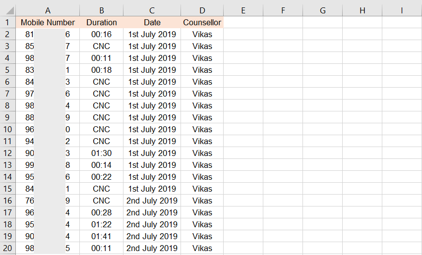
What this dashboard would do is to take all of this data and present it on the dashboard day-wise and agent-wise. And this is what the final dashboard will look like.
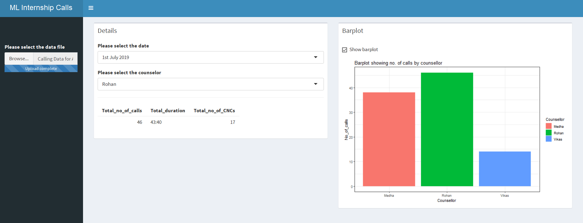
As I mentioned, this is the most basic form of the dashboard that you can make. But this is enough for you to understand how you can create an interactive dashboard in R and represent all your data in an interesting manner.
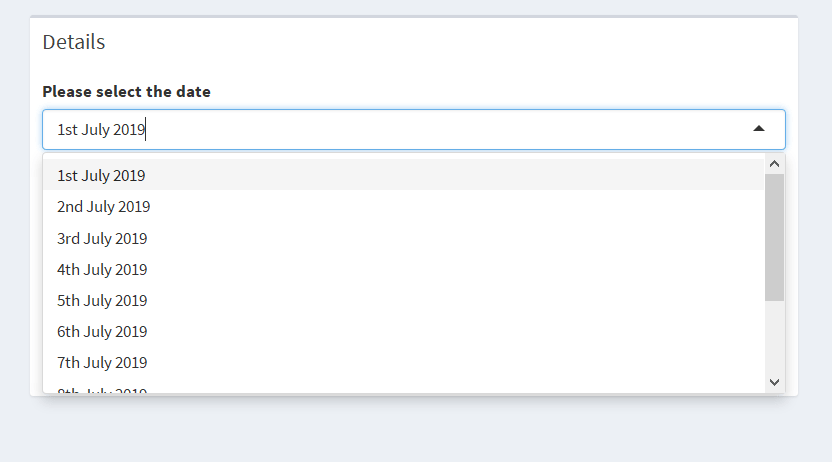
In this dashboard, I can select the date the data of which I want to see.
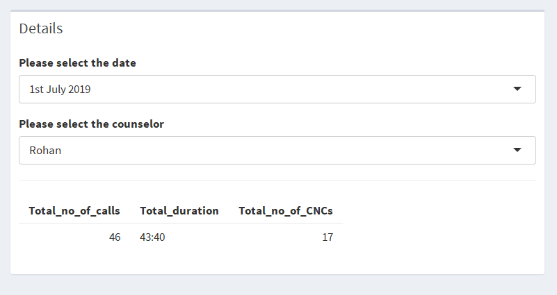
Once I select the date, I can select the name of the agent and the total call duration of that agent will be presented on the screen.
Finally, for that given day, I can see the duration of the calls made agent-wise.
How I created a basic sales dashboard in R?
I had spent quite a lot of time during my MBA learning R for Data Science. And R has something really unique and powerful that I required to pull-off this thing that I had planned. That is the package called - Shiny.
Shiny in R is a package that helps you to build interactive dashboards and web apps with R. Let me tell you the step by step approach that I used to build an interactive shiny R dashboard.
1. Loading R Packages
In order to create a code in R, one needs to install packages. These packages have pre-defined functions that are used as building blocks to put together any code in R.
Here are the packages that I loaded into my R environment.
# required packages
library(shiny)
library(shinydashboard)
library(tidyverse)
library(readxl)
library(lubridate)
These essential packages should be loaded in your R environment before you run the code. These contain dependencies that are required to run the entire code.
2. Building the layout
Every web app in Shiny is made up of two components i) UI and ii) the Server.
The UI comprises of all the front-end elements of the app that come up on the screen. This includes the buttons, visualizations and other input & output elements.
The Server is the back-end of the app where all the operations are coded. This includes things like where to pick the data form (data retrieval), which operations to perform on that data (data manipulation) and how to present the data (data visualization).
In the next step, I defined the UI and the Server of my app. I wrote the following lines of code which develop the skeleton of my sales dashboard app.
# required packages
library(shiny)
library(shinydashboard)
library(tidyverse)
library(readxl)
library(lubridate)
# Define UI for the application
ui <- dashboardPage(
dashboardHeader(),
dashboardSidebar(),
dashboardBody()
)
# Define Server for the application
server <- function(input, output) { }
shinyApp(ui, server)
After writing this code if I execute the code, this is how the skeleton of the shiny app looks like.
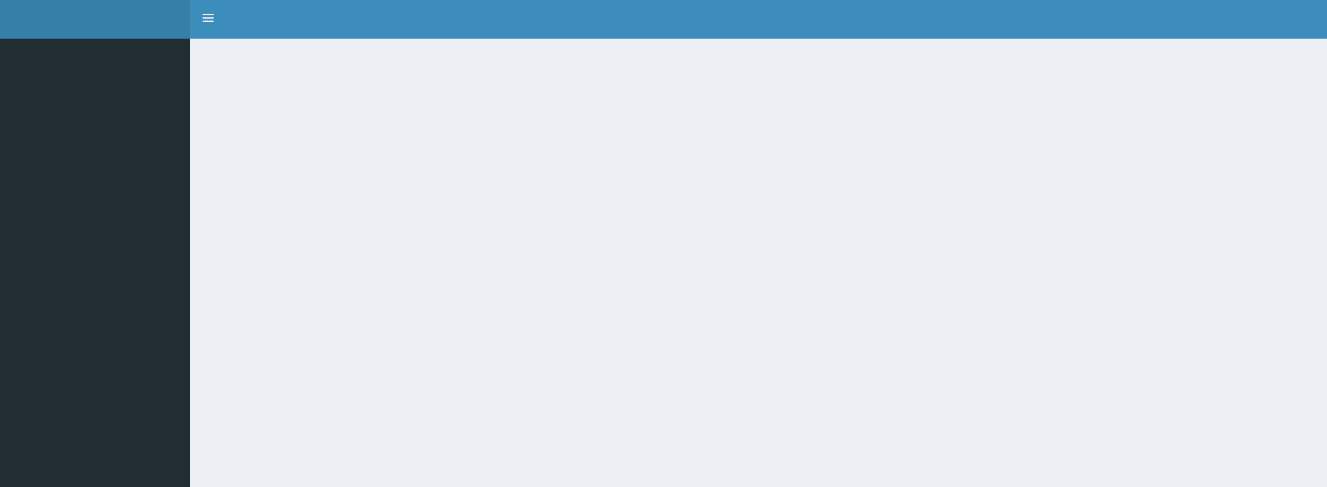
You will be able to see how beautifully our new web app is shaping up. You will be able to see that the background is the same as that in the final dashboard image that I shared above.
Now let’s move to the next step, that is adding basic textual and input/output elements into our dashboard.
3. Adding the input and output elements
Now that the skeleton is ready, I will add some basic bells and whistles on the dashboard which will help me customize it. And most important I will add up all the input and output functions that will be required to get this dashboard to function.
First of all, I need to write arguments within the functions that I have already written while defining my skeleton. But not just that.
I write some other important code in the server part of the program which will enable the app to read the data from excel and create the visualization that I want.
So I go ahead and write the following line of code. This is the complete code that is required to run this app.
# required packages
library(shiny)
library(shinydashboard)
library(tidyverse)
library(readxl)
library(lubridate)
# Define UI for application
ui <- dashboardPage(skin = "blue",
# the header for the app
dashboardHeader(title = "ML Internship Calls"),
# the sidebar for the app
dashboardSidebar(
br(), br(), br(),
fileInput("data", "Please select the data file")
),
# the body for the app
dashboardBody(
tabItem(
tabName = "the_app",
box(
title = "Details",
uiOutput("date"),
uiOutput("counselor"),
hr(),
tableOutput("table")
),
box(
title = "Barplot",
checkboxInput("bar", "Show barplot"),
plotOutput("bar")
)
)
)
)
# Define server logic
server <- function(input, output) {
# reading the data
data = reactive({
read_xlsx(input$data$datapath, col_types = c("numeric", "date",
"text", "text"))
})
# input for the counselor
output$counselor = renderUI({
if(!is.null(input$data)){
selectInput("counselor", "Please select the counselor",
choices = unique(data()$Counsellor))
}
})
# input for date
output$date = renderUI({
if(!is.null(input$data)){
selectInput("date", "Please select the date",
choices = unique(data()$Date))
}
})
d = reactive({
data() %>%
filter(Date == input$date) %>%
filter(Counsellor == input$counselor)
})
# the output table
output$table <- renderTable({
if(!is.null(input$data)){
# total calls
n = nrow(d())
# getting the number of cncs
cncs = sum(is.na(d()$Duration))
# getting the duration
dur = sum(hour(d()$Duration) * 60 + minute(d()$Duration), na.rm = T)
dur2 = paste0(floor(dur/60), ":", dur%%60)
# final data to output
data.frame("Total_no_of_calls" = n,
"Total_duration" = dur2,
"Total_no_of_CNCs" = cncs
)
}
})
d2 = reactive({
data() %>%
filter(Date == input$date) %>%
group_by(Counsellor) %>%
summarise(No_of_calls = n())
})
# the output barplot
output$bar = renderPlot({
if(input$bar){
d2() %>%
ggplot(aes(x = Counsellor, y = No_of_calls)) +
geom_bar(stat = "identity", aes(fill = Counsellor)) +
theme_bw() +
ggtitle("Barplot showing no. of calls by counsellor")
}
})
}
# Run the application
shinyApp(ui = ui, server = server)
This is the final code that I created to build this app. Now, most parts of this code will not be easy for you to understand at all. Explaining what each line of code does in this program is beyond the scope of this blog post.
But the objective is to give you a sense of how an app can be built in R that can make the process of data visualization extremely interactive.
4. Final Interactive Dashboard
Here is what the final dashboard looks like. This shows the visualization of how each of my sales agent made calls of how much duration.

Conclusion
What I shared with you in this article is how you can make your data visualization far more interesting by creating interactive dashboards using the Shiny package in R. The example from my own work life would have helped you understand how expressing your data through dashboards can significantly improve your narrative.
The code given in this post will help you design your own dashboard, to an extent. I hope this, one extremely powerful application of R, will encourage you to learn data science now.


